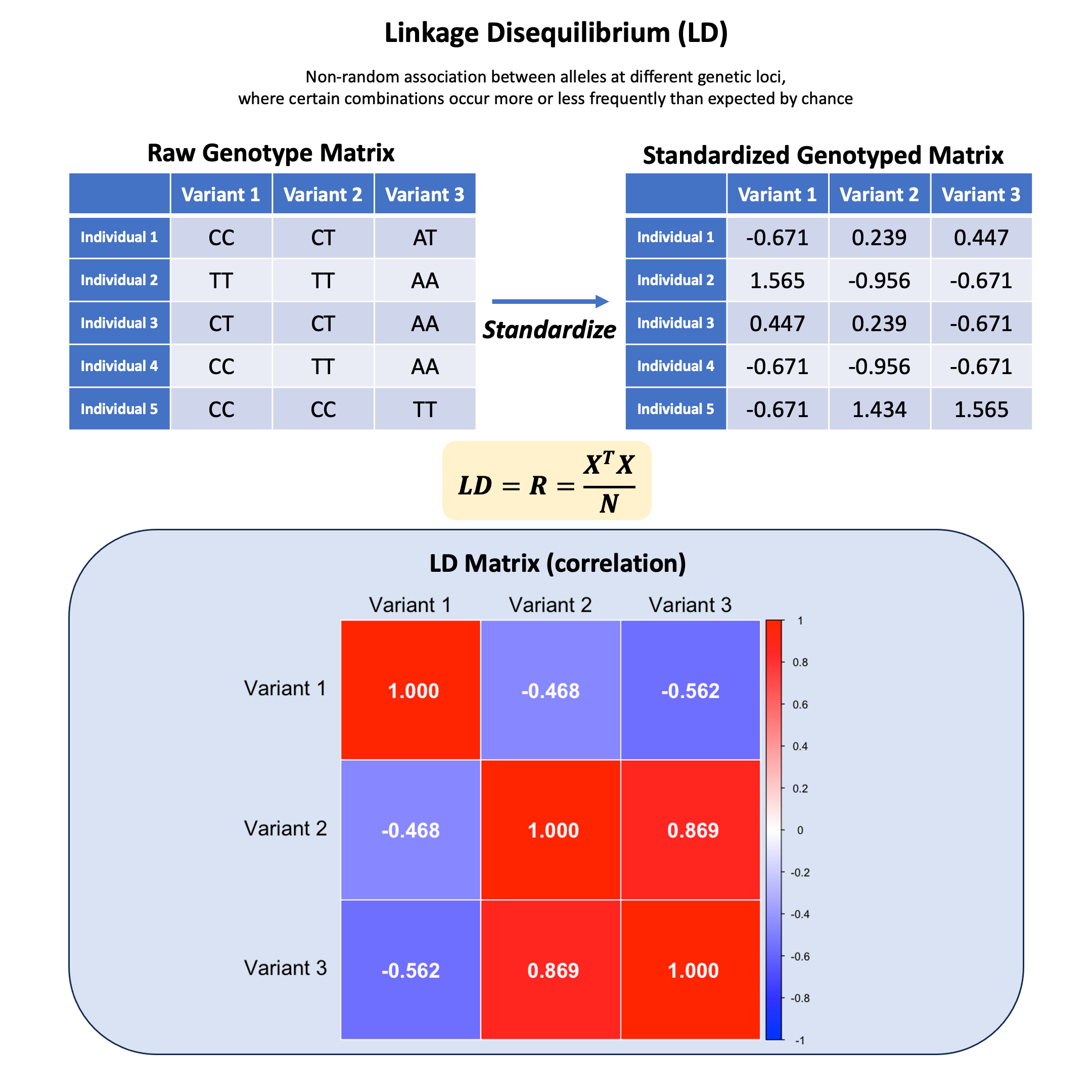
Linkage Disequilibrium#
Linkage disequilibrium is the non-random association between alleles at different genetic loci, where certain combinations occur more or less frequently than would be expected by chance if the loci were segregating independently.
Graphical Summary#
Key Formula#
Given a standardized genotype matrix \(\mathbf{X}\) (each column has mean 0 and variance 1), the LD matrix can be computed as:
where:
\(\mathbf{X}\) is the centered genotype matrix.
\(N\) is the number of individuals.
When \(\mathbf{X}\) is scaled, the covariance matrix is the same as correlation matrix.
Technical Details#
Each element in \(\mathbf{R}\) can be denoted as \(r\) where \(r\) is the correlation between two variants, ranging from -1 to 1. If it is 1 or -1, it means that the two variants are in perfect LD (markers are perfect proxies for each other). If \(r^2=0\), it indicates that no association between markers.
Interpreting LD Values#
High LD (\(r^2 > 0.8\)):
Alleles at different loci appear together much more frequently than expected
Frequencies of alleles in high LD are similar to each other
Markers can often serve as proxies for each other in genetic studies
Likely physical proximity on chromosome or recent selection
Less recombination between markers
Moderate LD (\(0.2 < r^2 < 0.8\)):
Some association between loci, but not strong enough for perfect tagging
Partial information about one locus given the other
Low LD (\(r^2 < 0.2\)):
Loci segregate nearly independently
May indicate distant physical location or sufficient time for recombination
LD Blocks#
LD blocks are the regions of the genome with consistently high LD among SNPs.
Characteristics:
Typically separated by recombination hotspots
SNPs within a block are highly correlated and tend to be inherited together
Block size typically ranges from a few kb to >100 kb
Can be visualized as triangular “heat maps” of pairwise LD values
Significance:
Allow efficient tagging of untyped variants using representative SNPs
Reduce genotyping costs by capturing maximum information with minimum markers
Define natural units for haplotype analysis
Inform optimal imputation strategies
Different patterns across populations:
African populations:
Shorter LD blocks (typically 5-15 kb)
More haplotype diversity
Due to older population age and larger ancestral effective population size
European populations:
Intermediate LD blocks (typically 15-50 kb)
Reflects out-of-Africa bottleneck and subsequent population expansion
East Asian populations:
Often longer LD blocks (can exceed 50 kb)
Due to more recent bottlenecks and founder effects
Isolated populations (e.g., Finnish, Sardinian):
Even more extensive LD
Due to founder effects and genetic drift in small populations
Example#
We’ve learned how to encode genotypes and standardize them, but what happens when we look at relationships between different variants? Are genetic variants independent of each other, or do they show patterns of correlation?
Let’s use our familiar dataset of 5 individuals at 3 variants to explore how genetic variants can be correlated with each other, and what this correlation matrix tells us about the genetic structure in our sample.
# Clear the environment
rm(list = ls())

# Define genotypes for 5 individuals at 3 variants
# These represent actual alleles at each position
# For example, Individual 1 has genotypes: CC, CT, AT
genotypes <- c(
 "CC", "CT", "AT",  # Individual 1
 "TT", "TT", "AA",  # Individual 2
 "CT", "CT", "AA",  # Individual 3
 "CC", "TT", "AA",  # Individual 4
 "CC", "CC", "TT"   # Individual 5
)
# Reshape into a matrix
N = 5
M = 3
geno_matrix <- matrix(genotypes, nrow = N, ncol = M, byrow = TRUE)
rownames(geno_matrix) <- paste("Individual", 1:N)
colnames(geno_matrix) <- paste("Variant", 1:M)

alt_alleles <- c("T", "C", "T")

# Convert to raw genotype matrix using the additive / dominant / recessive model
Xraw_additive <- matrix(0, nrow = N, ncol = M) # dount number of non-reference alleles

rownames(Xraw_additive) <- rownames(geno_matrix)
colnames(Xraw_additive) <- colnames(geno_matrix)

for (i in 1:N) {
  for (j in 1:M) {
    alleles <- strsplit(geno_matrix[i,j], "")[[1]]
    Xraw_additive[i,j] <- sum(alleles == alt_alleles[j])
  }
}
Then we scale the genotype matrix so that each column (variant) has mean 0 and variance 1.
X <- scale(Xraw_additive, center = TRUE, scale = TRUE)
X
| Variant 1 | Variant 2 | Variant 3 | |
|---|---|---|---|
| Individual 1 | -0.6708204 | 0.2390457 | 0.4472136 |
| Individual 2 | 1.5652476 | -0.9561829 | -0.6708204 |
| Individual 3 | 0.4472136 | 0.2390457 | -0.6708204 |
| Individual 4 | -0.6708204 | -0.9561829 | -0.6708204 |
| Individual 5 | -0.6708204 | 1.4342743 | 1.5652476 |
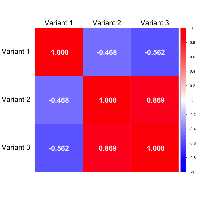
We use the cor function in R to calculate the correlation:
R = cor(X)
R
| Variant 1 | Variant 2 | Variant 3 | |
|---|---|---|---|
| Variant 1 | 1.0000000 | -0.4677072 | -0.562500 |
| Variant 2 | -0.4677072 | 1.0000000 | 0.868599 |
| Variant 3 | -0.5625000 | 0.8685990 | 1.000000 |
We also verify that the correlation matrix is identical to the covariance matrix:
cov(X)
| Variant 1 | Variant 2 | Variant 3 | |
|---|---|---|---|
| Variant 1 | 1.0000000 | -0.4677072 | -0.562500 |
| Variant 2 | -0.4677072 | 1.0000000 | 0.868599 |
| Variant 3 | -0.5625000 | 0.8685990 | 1.000000 |
Supplementary#
Graphical Summary#
# Load required library
library(corrplot)

# Create correlation heatmap with reversed order
corrplot(R, method = "color",
         col = colorRampPalette(c("blue", "white", "red"))(200),
         addCoef.col = "white",  # Change coefficient color to white
         number.cex = 1.5,       # Make font bigger (default is 1)
         number.digits = 3,      # Keep 3 digits
         tl.col = "black",       # Text label color
         tl.srt = 0,             # No angle (horizontal text)
         tl.cex = 1.5,           # Make variable labels larger
         tl.offset = 0.8,        # Move top labels further up
         is.corr = TRUE,         # Set to TRUE for correlation matrix
         order = "original",     # Keep original order
         cl.pos = "r",           # Position color legend on right
         cl.ratio = 0.2,         # Make legend wider
         cl.offset = 0.5,        # Move legend further from the plot
         addgrid.col = "white")        # Set grid line width
corrplot 0.95 loaded